- Home
- NAHQ
- Certified Professional in Healthcare Quality Examination
- NAHQ.CPHQ.v2025-02-15.q136
- Question 51
Valid CPHQ Dumps shared by ExamDiscuss.com for Helping Passing CPHQ Exam! ExamDiscuss.com now offer the newest CPHQ exam dumps, the ExamDiscuss.com CPHQ exam questions have been updated and answers have been corrected get the newest ExamDiscuss.com CPHQ dumps with Test Engine here:
Access CPHQ Dumps Premium Version
(635 Q&As Dumps, 35%OFF Special Discount Code: freecram)
<< Prev Question Next Question >>
Question 51/136
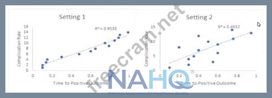
An organization has compiled the scatter plots below:
Based on these plots, which of the following conclusions can be made by the quality professional?
Based on these plots, which of the following conclusions can be made by the quality professional?
Correct Answer: C
* A scatter plot is a graphical tool that shows the relationship between two continuous variables by plotting data points at their corresponding values on the x-axis and y-axis1.
* To interpret a scatter plot, we need to look at the direction, strength, and shape of the relationship between the variables2.
* The direction of the relationship indicates whether the variables tend to increase or decrease together (positive correlation) or in opposite directions (negative correlation).
* The strength of the relationship indicates how closely the data points cluster around a line or curve that best fits the data. A common measure of the strength of the linear relationship is the correlation coefficient , which ranges from -1 to 1. The closer the absolute value of R is to 1, the stronger the linear relationship2.
* The shape of the relationship indicates whether the data points follow a straight line (linear relationship) or a curved pattern (nonlinear relationship).
* Based on these criteria, we can analyze the scatter plots for Setting 1 and Setting 2 as follows:
* Setting 1: The scatter plot shows a clear upward trend, indicating a positive correlation between complication rate and time to positive outcome. The data points are tightly clustered around a line, indicating a strong linear relationship. The R^2 value of 0.9533 on the plot is close to 1, which means that the linear model explains 95.33% of the variation in the complication rate.
Therefore, we can conclude that Setting 1 has a strong positive correlation between complication rate and time to positive outcome.
* Setting 2: The scatter plot shows a scattered pattern, indicating a weak or no correlation between complication rate and time to positive outcome. The data points are widely spread around a line, indicating a weak linear relationship. The R^2 value of 0.4923 on the plot is far from 1, which means that the linear model explains only 49.23% of the variation in the complication rate.
Therefore, we cannot conclude that Setting 2 has a significant correlation between complication rate and time to positive outcome, or that complication rates are causing longer time to positive outcome at setting 2.
References: 1: 8.8 Scatter Plots, Correlation, and Regression Lines 2: Scatterplots: Using, Examples, and Interpreting


- Question List (136q)
- Question 1: Analysis has shown that there Is a significant delay in rece...
- Question 2: For which incident would a process improvement manager be re...
- Question 3: A strategy to address social determinants of health would be...
- Question 4: A patient safety program can best be enhanced by which of th...
- Question 5: Which of the following presents a set of high-level measures...
- Question 6: A patient safety manager is asked to recommend the best acti...
- Question 7: A healthcare quality professional is conducting a study to d...
- Question 8: A department director has been asked to compare the producti...
- Question 9: Organizations with a positive safety culture are best charac...
- Question 10: A hospital Is anticipating an accreditation survey In the ne...
- Question 11: The clinic has a goal to reduce the Healthcare Effectiveness...
- Question 12: Which of the following is the most effective method to ident...
- Question 13: While the use of technology may result in fewer medical erro...
- Question 14: An ambulatory care practice has reviewed data to identify pa...
- Question 15: A quality professional is creating a training session for cl...
- Question 16: Which of the following is one purpose of clinical pathways?...
- Question 17: After discharge, most patients with a mental health diagnosi...
- Question 18: A hospital is considering changing the process of admissions...
- Question 19: An organization has Implemented a quality improvement projec...
- Question 20: An improvement project was implemented to expand utilization...
- Question 21: A healthcare organization wishes to develop an education pla...
- Question 22: A study was performed to compare quality outcomes between ca...
- Question 23: The expectation to maintain continuous survey readiness must...
- Question 24: The preferred culture in promoting patient safety...
- Question 25: A multidisciplinary team has been convened to review delays ...
- Question 26: A nursing director for a unit in a cancer hospital Is review...
- Question 27: An organization's culture is best assessed by examining the...
- Question 28: A nursing home has established a quality indicator to accomp...
- Question 29: Based on the data below, which unit should the quality Impro...
- Question 30: Which of the following Is true of a clinical pathway?...
- Question 31: Accountability for quality ultimately rests with the...
- Question 32: Which of the following represents a medically underserved po...
- Question 33: The quality manager needs to identify a set of process measu...
- Question 34: A quality professional was asked to assist with strategic pl...
- Question 35: Even when appropriate processes are in place, errors can occ...
- Question 36: When prioritizing quality improvement initiatives, which of ...
- Question 37: An internal customer of the admission process in a skilled n...
- Question 38: A hospital received 50 Incident reports describing falls tha...
- Question 39: The strategic plan for an organization calls for expansion o...
- Question 40: Which initiative should a quality professional promote in an...
- Question 41: In a data set, the difference between the highest and lowest...
- Question 42: A quality Improvement team has Identified specific changes t...
- Question 43: Leadership at an outpatient multi-specialty clinic Is workin...
- Question 44: An organization conducts daily briefing sessions. Which of t...
- Question 45: Which of the following would best facilitate the development...
- Question 46: The primary purpose of practice guidelines is to...
- Question 47: Prior to implementing a new patient service, the healthcare ...
- Question 48: The purpose of sentinel event review of never events is to...
- Question 49: An organization has implemented a quality improvement projec...
- Question 50: When reporting infection control indicators to a governing b...
- Question 51: An organization has compiled the scatter plots below: (Exhib...
- Question 52: A key concept in patient safety planning is to design proced...
- Question 53: Which of the following Is an example of active surveillance?...
- Question 54: A continuous survey readiness program requires which of the ...
- Question 55: Which of the following tools would best display nosocomial i...
- Question 56: An effective meeting requires which of the following?...
- Question 57: A performance improvement specialist at an ambulatory surger...
- Question 58: A performance improvement team was formed to reduce the inap...
- Question 59: Which of the following is the most effective means of commun...
- Question 60: Which of the following data sources can be used to assess a ...
- Question 61: Which of the following approaches best allows an agency to a...
- Question 62: A healthcare quality professional has identified a gap In pr...
- Question 63: Technology design that prevents a certain action, or require...
- Question 64: Which of the following tools Is most effective in assisting ...
- Question 65: Each department in a hospital self-monitors and reports hand...
- Question 66: To determine how much variability in a process Is due to ran...
- Question 67: Based on the chart below, implementing which of the followin...
- Question 68: The healthcare quality professional has been asked to partic...
- Question 69: The safety reporting system being used by an organization ca...
- Question 70: A healthcare system has multiple medical clinics across a la...
- Question 71: During the course of a root cause analysis, the team found t...
- Question 72: Managed care outcomes related to HEDIS measures are most com...
- Question 73: A provider's Ongoing Professional Practice Evaluation (OPPE)...
- Question 74: A home healthcare organization is looking to identify third-...
- Question 75: Before patient outcome data can be used for benchmarking, th...
- Question 76: The desired outcome of peer review Is to...
- Question 77: A quality professional needs to select a new project from a ...
- Question 78: A healthcare organization has recently launched a diabetes c...
- Question 79: Which of the following is the most effective method to ident...
- Question 80: Which of the following is the best approach to motivate stak...
- Question 81: Which of the following is an effective method to motivate em...
- Question 82: Following evaluation of the compounding process used by a ph...
- Question 83: A long-term care facility Is Interested in analyzing data to...
- Question 84: Which tool Is used to Identify resources needed to complete ...
- Question 85: Performance Improvement plans are most successful when linke...
- Question 86: In a healthcare organization Implementing ongoing performanc...
- Question 87: Which of the following most accurately describes medication ...
- Question 88: The health department cited a clinic for storing used instru...
- Question 89: A managed care peer review committee should obtain which of ...
- Question 90: A rapid cycle improvement team has met for six months. The t...
- Question 91: The main goal of a clinical pathway/guideline Is lo...
- Question 92: A healthcare quality professional can conclude that clinical...
- Question 93: An important responsibility of each team member working on a...
- Question 94: A healthcare quality professional Is facilitating the establ...
- Question 95: A nurse inadvertently hung an IV medication on the wrong pat...
- Question 96: A healthcare quality Improvement team is working on an actio...
- Question 97: Practice guidelines should be based on...
- Question 98: An organization Is evaluating the data used to measure compl...
- Question 99: Which of the following quality Improvement Tools Is best for...
- Question 100: An organization recently completed an analysis of safety eve...
- Question 101: Which of the following is the key responsibility of a health...
- Question 102: The quality Improvement (Ql) specialist recognizes that any ...
- Question 103: During development of a clinical pathway, a quality professi...
- Question 104: A healthcare quality professional Is assisting an organizati...
- Question 105: Annual evaluation of a quality Improvement process must...
- Question 106: A patient safety manager provided training on hand hygiene g...
- Question 107: Choosing a small number of items to represent characteristic...
- Question 108: A health system in an underserved area seeks to improve medi...
- Question 109: Which of the following regulatory agencies oversee developme...
- Question 110: An interdisciplinary learn met to review readmission rates a...
- Question 111: Which of the following is the best example of a patient-cent...
- Question 112: Which of the following is used to assess points of vulnerabi...
- Question 113: Which of the following should a healthcare plan use to colle...
- Question 114: A healthcare organization has decided that the healthcare qu...
- Question 115: A hospital installed a new patient safety event reporting sy...
- Question 116: An organization that demonstrates a culture of safety...
- Question 117: An emergency department's quality Improvement report for the...
- Question 118: An organization has Just experienced a wrong site surgery. A...
- Question 119: A healthcare organization has been providing cardiac care to...
- Question 120: Data from an Incident reporting system compares Incident rat...
- Question 121: A new urgent care clinic is setting up a quality management ...
- Question 122: The best means of reducing sentinel events In a care deliver...
- Question 123: Which management accountability action should be Implemented...
- Question 124: Which of the following Is an algorithm that Is designed to c...
- Question 125: Which of the following provides support and subject matter e...
- Question 126: A team has been working together for six months to improve a...
- Question 127: To assess compliance with quality standards, a healthcare or...
- Question 128: The quality manager needs to identify a set of process measu...
- Question 129: A healthcare quality professional wants to find out whether ...
- Question 130: A department analyzed Its process for distributing paychecks...
- Question 131: In recent months, the amount of time It takes for Insurance ...
- Question 132: Multi-voting Is frequently used in which of the following st...
- Question 133: A performance Improvement team has been formed and assigned ...
- Question 134: An extended care facility measures the percent of time a com...
- Question 135: One of the first steps in preparing for an organizational ac...
- Question 136: A healthcare quality professional receives complaints from n...
