Valid DA0-001 Dumps shared by ExamDiscuss.com for Helping Passing DA0-001 Exam! ExamDiscuss.com now offer the newest DA0-001 exam dumps, the ExamDiscuss.com DA0-001 exam questions have been updated and answers have been corrected get the newest ExamDiscuss.com DA0-001 dumps with Test Engine here:
Access DA0-001 Dumps Premium Version
(398 Q&As Dumps, 35%OFF Special Discount Code: freecram)
<< Prev Question Next Question >>
Question 15/149
An analyst is designing a dashboard to determine which site has the highest percentage of new customers. The analyst must choose an appropriate chart to include in the dashboard. The following data is available:
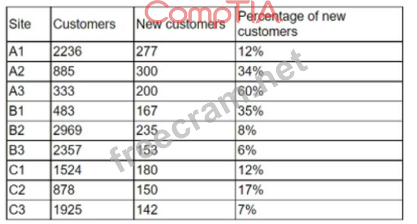
Which of the following types of charts should be considered to best display the data?
Which of the following types of charts should be considered to best display the data?
Correct Answer: A
The best type of chart to display the data is A. Include a bar chart using the site and the percentage of new customers data.
A bar chart is a good choice for comparing categorical data with numerical data, such as the site and the percentage of new customers. A bar chart can show the relative differences between the sites and highlight the site with the highest percentage of new customers. A bar chart can also be easily labeled and formatted to make the data clear and understandable.
A line chart is not suitable for this data, because it is used to show trends or changes over time, which is not relevant for the site and the percentage of new customers data. A line chart would also be confusing and misleading, as it would imply a connection or correlation between the sites that does not exist.
A pie chart is also not a good choice for this data, because it is used to show the proportion of a whole, not the comparison of different categories. A pie chart would also be difficult to read and interpret, as it would require labels or legends to identify the sites and their percentages. A pie chart would also not be able to show the exact values of the percentages, only their relative sizes.
A scatter chart is another inappropriate option for this data, because it is used to show the relationship or correlation between two numerical variables, not between a categorical and a numerical variable. A scatter chart would also be cluttered and unclear, as it would plot each site as a point on a coordinate plane, without any labels or axes. A scatter chart would also not be able to show the differences or rankings between the sites and their percentages.


- Question List (149q)
- Question 1: Given the below: (Exhibit) Which of the following numbers re...
- Question 2: A customer's telephone number is in the format 123-456-7890....
- Question 3: Given the following table: (Exhibit) Which of the following ...
- Question 4: During data profiling, an analyst decides to recode the stat...
- Question 5: Given the table below: (Exhibit) Which of the following vari...
- Question 6: Five dogs have the following heights in millimeters: 300, 43...
- Question 7: Which of the following is the correct data type for text?...
- Question 8: A reporting analyst is creating a dashboard that shows the y...
- Question 9: Which of the following is the best reason for removing data ...
- Question 10: Which of the following report types is most appropriate for ...
- Question 11: Which of the following is the best technique for transferrin...
- Question 12: A marketing analytics team received customer transaction dat...
- Question 13: A data analyst is designing a dashboard that will provide a ...
- Question 14: A data analyst has been asked to organize the table below in...
- Question 15: An analyst is designing a dashboard to determine which site ...
- Question 16: 'Which of the following is the BEST reason to use database v...
- Question 17: Which of the following statements would be used to append tw...
- Question 18: After the daily ETL jobs are completed, the data in the repo...
- Question 19: A salesperson who is prospecting potential clients collected...
- Question 20: What SQL command is used to delete an entire table from a da...
- Question 21: While reviewing survey data, a research analyst notices data...
- Question 22: An analyst is reporting on the average income for a county a...
- Question 23: A financial analyst is creating a daily billing report for a...
- Question 24: Five dogs have the following heights in millimeters: 300,430...
- Question 25: Which of the following is a common data analytics tool that ...
- Question 26: An analyst needs to join two tables of data together for ana...
- Question 27: Given the image below: (Exhibit) Which of the following file...
- Question 28: An organization wants to evaluate whether project activities...
- Question 29: Given the data below: (Exhibit) In which of the following fi...
- Question 30: Mario works with a group of R programmers tasked with copyin...
- Question 31: You are working with a professional statistician to perform ...
- Question 32: Which of the following will MOST likely be streamed live?...
- Question 33: Which of the following data types must be used when working ...
- Question 34: A sales analyst needs to report how the sales team is perfor...
- Question 35: Which of the following is an example of a data-mining ETL to...
- Question 36: A sales team wants visibility of current sales numbers, pipe...
- Question 37: Which of the following data manipulation techniques is an ex...
- Question 38: A data analyst needs to perform a full outer join of a custo...
- Question 39: A report is scheduled to run and be distributed at the end o...
- Question 40: A data analyst is asked on the morning of April 9, 2020, to ...
- Question 41: A database consists of one fact table that is composed of mu...
- Question 42: An e-commerce company recently tested a new website layout. ...
- Question 43: An analyst needs to know what data an organization possesses...
- Question 44: Which of the following is the best description of the term "...
- Question 45: A table in a hospital database has a column for patient heig...
- Question 46: A data analyst needs to create a weekly recurring report on ...
- Question 47: A gambler thinks that a coin is fair and is equally likely t...
- Question 48: A database administrator needs to ensure only approved users...
- Question 49: The process of performing initial investigations on data to ...
- Question 50: Consider this dataset showing the retirement age of 11 peopl...
- Question 51: Which of the following types of analysis would be best for a...
- Question 52: A data analyst has been asked to create one table that has e...
- Question 53: Which of the following is a non-parametric test?...
- Question 54: An analyst is designing a dashboard to determine which site ...
- Question 55: An analyst is working with the income data of suburban famil...
- Question 56: Which of the following tools would be best to use to calcula...
- Question 57: What role in a data governance is typically responsible for ...
- Question 58: A cereal manufacturer wants to determine whether the sugar c...
- Question 59: Angela is aggregating data from CRM system with data from an...
- Question 60: Jenny wants to study the academic performance of undergradua...
- Question 61: Which of the following is the most likely reason for a data ...
- Question 62: Which of the following analysis techniques is an unsupervise...
- Question 63: A research analyst collects ten data points from 1.000 speci...
- Question 64: When analyzing the values of two variables, you decide to co...
- Question 65: Which of the following is a best practice when updating a le...
- Question 66: A company's marketing department wants to do a promotional c...
- Question 67: A company notifies its employees that emails will be automat...
- Question 68: A client wants a new report that will be automatically email...
- Question 69: Which of the following should be accomplished NEXT after und...
- Question 70: Which of the following is an example of structured data?...
- Question 71: An analyst is working with a data set that lists individuals...
- Question 72: A data set for sales per month includes the following data: ...
- Question 73: Which of the following is a KPI metric for tracking sales pe...
- Question 74: An analyst is building a new dashboard for a user. After an ...
- Question 75: Which of the following would a data analyst look for first i...
- Question 76: A data analyst has been asked to merge the tables below, fir...
- Question 77: A data analyst has a set of data that shows the number of ga...
- Question 78: Which of the following is a process that is used during data...
- Question 79: Which of the following data types would a telephone number f...
- Question 80: Which one of the following would not normally be considered ...
- Question 81: A military commander would like to see the health scorecards...
- Question 82: An analyst is designing a dashboard that will provide a stor...
- Question 83: An analyst collected data that includes primary account numb...
- Question 84: Which of the following data governance concepts fits into th...
- Question 85: A data analyst is designing a dashboard that will provide a ...
- Question 86: A data analyst needs to apply quality control concepts to a ...
- Question 87: Given the following tables: (Exhibit) Which of the following...
- Question 88: Which of the following is the best reason to use database vi...
- Question 89: Which of the following reports can be used when insight into...
- Question 90: Which of the following programming languages are best suited...
- Question 91: Which of the following is a control measure for preventing a...
- Question 92: Which of the following describes the use of a representative...
- Question 93: A data analyst is creating a dashboard and trying to identif...
- Question 94: Which of the following best describes the law of large numbe...
- Question 95: Which of the following reports can be used when insight into...
- Question 96: A user receives a large custom report to track company sales...
- Question 97: Given the following data: (Exhibit) Which of the following B...
- Question 98: A business unit made the following modification to the value...
- Question 99: Which of the following actions should be taken when transmit...
- Question 100: An analyst is currently working on a ticket to revamp a comp...
- Question 101: An analyst has conducted a review of business questions. Whi...
- Question 102: An analyst is currently working on a ticket for revamping a ...
- Question 103: A database consists of one fact table that is composed of mu...
- Question 104: A sales director has requested a report for individual team ...
- Question 105: Which of the following BEST describes the issue in which cha...
- Question 106: Which of the following activities occurs during the ETL proc...
- Question 107: Which of the following are reasons to conduct data cleansing...
- Question 108: A data analyst is attempting to understand how ice cream con...
- Question 109: A data analyst is developing a dashboard to track and monito...
- Question 110: What subset of Structured Query Language (SQL) is used to ad...
- Question 111: A healthcare data analyst notices that one data set in the c...
- Question 112: Which of the following is most likely to be used as a data-m...
- Question 113: Which of the following statistical methods requires two or m...
- Question 114: Which of the following database schemas features normalized ...
- Question 115: An analyst wants to extract data from a variety of sources a...
- Question 116: A data analyst needs to collect a similar proportion of data...
- Question 117: Which of the following best describes a 95% confidence inter...
- Question 118: What analytics suite is offered by Microsoft and directly in...
- Question 119: A data analyst was asked to create a chart that shows the re...
- Question 120: Which of the following techniques is used to quantify data?...
- Question 121: An analyst has generated a report that includes the number o...
- Question 122: A Chief Executive Officer (CEO) is requesting more up-to-dat...
- Question 123: Given the table below: (Exhibit) Which of the following boxe...
- Question 124: A user imports a data file into the accounts payable system ...
- Question 125: A data analyst must separate the column shown below into mul...
- Question 126: An analyst conducted a preliminary analysis for a data set a...
- Question 127: A data analyst is helping a retail store categorize its cust...
- Question 128: Which of the following data types best describe 4Ac1? (Selec...
- Question 129: Standardized tests are given to students in the middle of ea...
- Question 130: Given the table below: (Exhibit) Which of the following vari...
- Question 131: Which of the following is a common data analytics tool that ...
- Question 132: You should always choose the analytics tool that is most app...
- Question 133: Consider the following dataset which contains information ab...
- Question 134: Which one of the following is a measure of dispersion?...
- Question 135: Joseph is interpreting a left skewed distribution of test sc...
- Question 136: Given the following grocery store orders: (Exhibit) If a que...
- Question 137: An analyst has received the requirements for an internal use...
- Question 138: An analyst has written the following code: SELECT * FROM Cus...
- Question 139: Which of the following best describes how discrete data diff...
- Question 140: A data analyst who works for a government agency is required...
- Question 141: Given the following data set: (Exhibit) Which of the followi...
- Question 142: A data analyst has received a data set that contains actual ...
- Question 143: Which of the following is an example of a flat file?...
- Question 144: Which of the following file formats is best suited to start ...
- Question 145: During data cleansing, an analyst conducts measures of centr...
- Question 146: A web developer wants to ensure that malicious users can't t...
- Question 147: Which of the following roles is responsible for ensuring an ...
- Question 148: Which of the following technologies would be best suited for...
- Question 149: Each month an analyst needs to execute a data pull for the t...
