- Home
- IIBA
- Certification in Business Data Analytics (IIBA - CBDA)
- IIBA.CBDA.v2024-06-17.q71
- Question 65
Valid CBDA Dumps shared by ExamDiscuss.com for Helping Passing CBDA Exam! ExamDiscuss.com now offer the newest CBDA exam dumps, the ExamDiscuss.com CBDA exam questions have been updated and answers have been corrected get the newest ExamDiscuss.com CBDA dumps with Test Engine here:
Access CBDA Dumps Premium Version
(152 Q&As Dumps, 35%OFF Special Discount Code: freecram)
<< Prev Question Next Question >>
Question 65/71
DIAGRAM
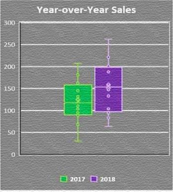
The following boxplot is produced from a dataset. From this boxplot which of the following conclusions can be drawn?
Year-over-Year Sales
300
200
The following boxplot is produced from a dataset. From this boxplot which of the following conclusions can be drawn?
Year-over-Year Sales
300
200
Correct Answer: B
According to the Guide to Business Data Analytics, a boxplot is used to provide a visual summary of one or more groups of data values through their quartiles. In this case, the boxplot shows two different years, 2017 and 2018, with distinct medians and interquartile ranges. The median is represented by the line inside the box, while the interquartile range is represented by the height of the box itself. Outliers are marked with circles above and below the box. From the boxplot, we can see that the median sales for 2018 are higher than the median sales for 2017, and the interquartile range for 2018 is narrower than the interquartile range for 2017.
This means that the sales for 2018 are more concentrated around the median and have less variability than the sales for 2017. Therefore, the correct answer is B.
References: Guide to Business Data Analytics, page 58-59; CBDA Exam Blueprint, page 7; [Introduction to Business Data Analytics: A Practitioner View], page 17.
![Year-over-Year Sales]


- Question List (71q)
- Question 1: An analyst is interested in determining whether their compan...
- Question 2: A marketing department has established an analytics team. Th...
- Question 3: The analytics team has completed their analytics work and ha...
- Question 4: A data scientist is performing statistical analysis and is i...
- Question 5: The analytics team has been asked to provide an estimate of ...
- Question 6: An analytics team has been asked to answer the following que...
- Question 7: An analyst is interested in providing a visual diagram to co...
- Question 8: The sales department is interested in using business analyti...
- Question 9: An analyst calculates the average, median, and mode values f...
- Question 10: The analytics team has been asked to determine if the organi...
- Question 11: A small business has recently launched their website and wan...
- Question 12: An analytics team is interested in reviewing the results of ...
- Question 13: The analytics team scheduled a meeting with key stakeholders...
- Question 14: Senior executives in a large organization receive numerous s...
- Question 15: A private school has decided to include bullet charts in stu...
- Question 16: As the organization looks to advance its analytics practices...
- Question 17: The analytics team has been asked to assess sales data from ...
- Question 18: The research question prompting the use of analytics is well...
- Question 19: An analyst at a phone manufacturing company is preparing a d...
- Question 20: A lab is conducting a study on protein interactions. They ha...
- Question 21: A marketing director has asked the question 'How many produc...
- Question 22: A financial software company has growth and expansion as one...
- Question 23: The interplay between enterprise systems and data analytics ...
- Question 24: The architecture team puts forth a solution architecture tha...
- Question 25: A consumer products company gained popularity with increased...
- Question 26: The analytics team is identifying research questions to addr...
- Question 27: Analytics is being used to estimate the number of machine br...
- Question 28: Interested in building out the analytics capability based on...
- Question 29: Interested in ensuring that analytics continues to contribut...
- Question 30: What is the relationship between a Customer entity and an Or...
- Question 31: A large car manufacturer is interested in comparing the numb...
- Question 32: An online retailer has been successful utilizing analytics t...
- Question 33: A food and beverage company would like to administer a surve...
- Question 34: The team has completed their analysis on a vast amount of co...
- Question 35: The Vice President at a commercial goods manufacturing compa...
- Question 36: A large telecommunications company wants to increase their A...
- Question 37: To support their recommendation, the analytics team has iden...
- Question 38: An analytics system is being developed by relying entirely o...
- Question 39: A job satisfaction study is being considered. Half of the em...
- Question 40: Which attribute in the Customerissues entity would be catego...
- Question 41: Allegra Consulting is planning on establishing an analytics ...
- Question 42: Operation managers are concerned about the increasing attrit...
- Question 43: The results for a certification exam were revealed in percen...
- Question 44: A large retail chain has asked their analytics team to compl...
- Question 45: A data dictionary is being developed for a dataset describin...
- Question 46: An HR manager attended a conference where the topic of HR an...
- Question 47: A brainstorming session is conducted to identify the researc...
- Question 48: A manufacturing company, specializing in turf maintenance eq...
- Question 49: A Data Dictionary is being developed for an employee databas...
- Question 50: From a prior analytics study, a telecommunications company h...
- Question 51: A call center has requested to review their sales conversion...
- Question 52: A financial institution is interested in leveraging analytic...
- Question 53: A new dataset describing employee salaries is received by a ...
- Question 54: While formulating the results from completed analysis, the a...
- Question 55: A fifty-year-old brick and mortar business is interested in ...
- Question 56: A government agency is conducting a study on the performance...
- Question 57: The analytics team has established two equally strong potent...
- Question 58: An analyst is tasked with helping the sales team make better...
- Question 59: An analyst is performing regression analysis and reviewing t...
- Question 60: A business analyst manager is planning budgets for the new y...
- Question 61: The results for a certification exam were revealed in percen...
- Question 62: An analyst is looking at a particular dataset that includes ...
- Question 63: A real estate broker is tracking monthly sales between two o...
- Question 64: The CustomerOrder entity will include information on all cus...
- Question 65: DIAGRAM The following boxplot is produced from a dataset. Fr...
- Question 66: A real estate broker is tracking monthly sales between two o...
- Question 67: The finance manager has reported that customers are taking m...
- Question 68: A professor at a university has received a few complaints of...
- Question 69: The marketing department for a major restaurant chain is int...
- Question 70: A grocery store chain has requested help in determining how ...
- Question 71: An HR manager attended a conference where the topic of HR an...
