- Home
- WGU
- WGU Web Development Applications
- WGU.Web-Development-Applications.v2025-02-17.q30
- Question 3
Valid Web-Development-Applications Dumps shared by EduDump.com for Helping Passing Web-Development-Applications Exam! EduDump.com now offer the newest Web-Development-Applications exam dumps, the EduDump.com Web-Development-Applications exam questions have been updated and answers have been corrected get the newest EduDump.com Web-Development-Applications dumps with Test Engine here:
Access Web-Development-Applications Dumps Premium Version
(138 Q&As Dumps, 35%OFF Special Discount Code: freecram)
<< Prev Question Next Question >>
Question 3/30
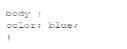
Given the following CSS statement:
Which code segment changes the font color when the viewport is 800 pixels wide or wider?
Which code segment changes the font color when the viewport is 800 pixels wide or wider?
Correct Answer: A
To change the font color when the viewport is 800 pixels wide or wider, a media query with min-width:
800px is used. This ensures that the styles inside the media query are applied only when the viewport width is at least 800 pixels.
* CSS Media Queries:
* Syntax for Media Query:
@media screen and (min-width: 800px) {
body {
color: black;
}
}
* Explanation: The min-width: 800px condition ensures that the styles are applied when the viewport is 800 pixels or wider.
* Example Analysis:
* Option A:
@media screen and (min-width: 800px) {
body {
color: black;
}
}
* Correct. This applies the color: black; style to the body when the viewport is 800 pixels or wider.
* Option B:
@media min-width: 800px {
body {
color: black;
}
}
* Incorrect. Missing screen and which is required for a proper media query targeting screens.
* Option C:
@media screen and (max-width: 800px) {
body {
color: black;
}
}
* Incorrect. This applies the style when the viewport is 800 pixels or narrower.
* Option D:
@media max-width: 800px {
body {
color: black;
}
}
* Incorrect. This applies the style when the viewport is 800 pixels or narrower.
* References:
* MDN Web Docs - Using media queries
* W3Schools - CSS Media Queries
The correct use of media queries ensures that the specified styles are applied only under the desired conditions, providing a responsive design.


- Question List (30q)
- Question 1: Given the following CSS code: (Exhibit) Which portion is the...
- Question 2: Which code segment contains a conditional expression?...
- Question 3: Given the following CSS statement: (Exhibit) Which code segm...
- Question 4: Which attribute displays help text in an input field without...
- Question 5: Given the following javaScript code: (Exhibit) Which code se...
- Question 6: Which feature was introduced in HTML5?...
- Question 7: Which 3D transform affects the distance between the z-plane ...
- Question 8: Given the following code: (Exhibit) What is the value of the...
- Question 9: Which HTML5 attribute specifies where to send the form data ...
- Question 10: Which element relies on the type attribute to specify accept...
- Question 11: Which framework assists designers with adaptive page layout?...
- Question 12: What is the effect of using the in-line validation process d...
- Question 13: A file named application, Appchache contains the following c...
- Question 14: A web designer creates the following HTML code: (Exhibit) Wh...
- Question 15: Which attribute is related to moving the mouse pointer of an...
- Question 16: A web page has a section that contains an <article> el...
- Question 17: What is the process for JavaScript from validation?...
- Question 18: Which tag is required when importing the jQuery library?...
- Question 19: Which layout design is easiest to manage on a variety of dev...
- Question 20: Which HTML element should a developer use to logically group...
- Question 21: Which markup ensures that the data entered are either a five...
- Question 22: Given the following HTML statement: (Exhibit) And the follow...
- Question 23: Given the following CSS code: (Exhibit) Which type of select...
- Question 24: What is the purpose of cascading style sheets (CSSs)?...
- Question 25: Given the following code: (Exhibit) What does the console di...
- Question 26: Given the following CSS code: (Exhibit) How many seconds ela...
- Question 27: What should be used to request and Update data in the backgr...
- Question 28: What allows a scripting language to manipulate elements on a...
- Question 29: What is the used to render images dynamically?...
- Question 30: A web page has the following CSS code: (Exhibit) Which selec...

[×]
Download PDF File
Enter your email address to download WGU.Web-Development-Applications.v2025-02-17.q30.pdf