Valid PL-100 Dumps shared by ExamDiscuss.com for Helping Passing PL-100 Exam! ExamDiscuss.com now offer the newest PL-100 exam dumps, the ExamDiscuss.com PL-100 exam questions have been updated and answers have been corrected get the newest ExamDiscuss.com PL-100 dumps with Test Engine here:
Access PL-100 Dumps Premium Version
(279 Q&As Dumps, 35%OFF Special Discount Code: freecram)
<< Prev Question Next Question >>
Question 107/110
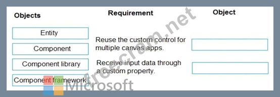
A company is building multiple Power Apps apps to support a mobile sales team.
The apps must all share a common control that has custom properties.
You need to create a solution for the apps.
Which objects should you use? To answer, drag the appropriate objects to the correct requirements. Each object may be used once, more than once, or not at all. You may need to drag the split bar between panes or scroll to view content.
NOTE: Each correct selection is worth one point.
Correct Answer:
Explanation
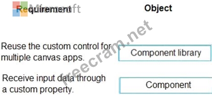
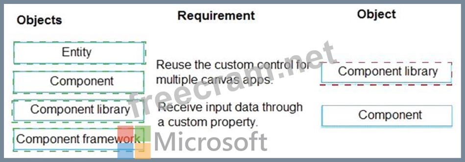
Box 1: Component library
Components are reusable building blocks for canvas apps so that app makers can create custom controls to use inside an app, or across apps using a component library. Components can use advanced features such as custom properties and enable complex capabilities.
By creating a component library, app makers easily share and update one or more components with other makers.
Component libraries are containers of component definitions that make it easy to:
Discover and search components.
Publish updates.
Notify app makers of available component updates.
Box 2: Component
A component can receive input values and emit data if you create one or more custom properties.
Reference:
https://docs.microsoft.com/en-us/powerapps/maker/canvas-apps/component-library
https://docs.microsoft.com/en-us/powerapps/maker/canvas-apps/create-component


- Question List (110q)
- Question 1: You are creating a canvas app. You need to store and retriev...
- Question 2: You are designing a data model for a new app. The app will b...
- Question 3: You need to meet the requirements for sales representative t...
- Question 4: You need to modify the entity form to resolve the customer r...
- Question 5: A company uses Power Apps. You embed a canvas app in a model...
- Question 6: You create a Power Platform solution. Solution data is store...
- Question 7: You create a canvas app. A user is not able to determine whi...
- Question 8: A company receives its marketing campaign performance report...
- Question 9: You have a basic user security role in a lest environment. Y...
- Question 10: You are an app maker for a college. You create an app for st...
- Question 11: Engineers in an organization plan to attend an international...
- Question 12: A company uses Microsoft Power Apps. You need to create a ca...
- Question 13: A company uses Power Apps. The company has a model-driven ap...
- Question 14: A company uses Power Apps. You design the interface for a ne...
- Question 15: The managers in an organization use a model-driven app. The ...
- Question 16: A company uses Microsoft Power Apps. You need to create a ca...
- Question 17: You are deploying solutions from development environments in...
- Question 18: Note: This question is part of a series of questions that pr...
- Question 19: A company is using Power Virtual Agents in Microsoft Teams t...
- Question 20: You create a dashboard in Power BI. You share the dashboard ...
- Question 21: You are an app designer for a hotel. The hotel wants to crea...
- Question 22: A company uses Microsoft Power Platform. You create a soluti...
- Question 23: You create a model-driven app for a company. The app will be...
- Question 24: A company has 500 products. Each product is referenced by a ...
- Question 25: A company has hundreds of warehouses. You are developing an ...
- Question 26: Rangers in national parks report wildlife they encounter dur...
- Question 27: You create a canvas app. You run App checker to validate the...
- Question 28: You need to design and distribute a chatbot that captures id...
- Question 29: You are creating a model-driven app. You must create new com...
- Question 30: You are developing an app for a package delivery company. De...
- Question 31: You create a canvas app named Hardware Order that suggests c...
- Question 32: Note: This question is part of a series of questions that pr...
- Question 33: You need to configure functionality for submitting status re...
- Question 34: A company is building a canvas app. A user needs to understa...
- Question 35: A company uses data from a publicly available web service. Y...
- Question 36: You are creating a model-driven app that allows users to cre...
- Question 37: A clothing retailer is creating a Power Virtual Agents chatb...
- Question 38: A company is creating new app for use by technicians. Previo...
- Question 39: An inside sales staff uses three model-driven apps for their...
- Question 40: You significantly modify a canvas app. You need to generate ...
- Question 41: You are creating a multi-page canvas app that loads tabular ...
- Question 42: Note: This question is part of a series of questions that pr...
- Question 43: You need to store a list of products and their colors. You h...
- Question 44: You create a canvas app. You need to ensure that there are n...
- Question 45: A company uses Microsoft Power Platform in a production envi...
- Question 46: A company is building several Power Apps apps to help with s...
- Question 47: A company uses Microsoft platforms for all accessibility, co...
- Question 48: You need to create a model-driven app without using code. Wh...
- Question 49: A company has a Common Data Service custom entity that store...
- Question 50: You need to roll back the mobile app to an earlier version. ...
- Question 51: Note: This question is part of a series of questions that pr...
- Question 52: You need to provide the app to Tailwind Traders. What should...
- Question 53: You are creating an employee directory canvas app. The app m...
- Question 54: A company uses Microsoft Power Platform. Users create charts...
- Question 55: You create an app with multiple screens. Test users report t...
- Question 56: You need to select tables to use for the main personas in th...
- Question 57: You are creating a capacity planning dashboard with Power BI...
- Question 58: Note: This question is part of a series of questions that pr...
- Question 59: You need to provide all app components of the application to...
- Question 60: You need to select a design approach for the required featur...
- Question 61: You are creating a canvas app. A small amount of tabular dat...
- Question 62: You are an app maker. You want to create apps and track cust...
- Question 63: A user named Bill Jones creates a canvas app and shares it w...
- Question 64: A company uses a canvas app to encourage employees to take r...
- Question 65: A company uses data loss prevention (DLP) policies. You have...
- Question 66: You perform repeatable tasks using software installed on a h...
- Question 67: You need to configure the system to meet the requirements. W...
- Question 68: You are developing a canvas app to monitor time. The app inc...
- Question 69: You need to connect to the data source for the Job Setup app...
- Question 70: A company uses Microsoft Power Apps. You need to create a ca...
- Question 71: A company uses Microsoft Teams and Microsoft 365. Employees ...
- Question 72: You create a new solution publisher and include a publisher ...
- Question 73: You are creating a canvas app. You need to display a limited...
- Question 74: You create a canvas app for technicians at a computer store....
- Question 75: Note: This question is part of a series of questions that pr...
- Question 76: You create a canvas app for a store. The logo must appear as...
- Question 77: A company uses Power Automate. You manage two cloud flows na...
- Question 78: You need to implement the change requested by the operations...
- Question 79: A commercial bakery uses an inventory system to track ingred...
- Question 80: You are designing an app for a bank. You plan to use the fol...
- Question 81: You receive ideas from employees in a Microsoft Teams channe...
- Question 82: You need to create the mobile app. Which type of app should ...
- Question 83: You are Designing a Power Virtual Agents chatbot in Microsof...
- Question 84: A company has ten sales regions. Each salesperson is assigne...
- Question 85: You are design ng a dashboard for a model driven app Users a...
- Question 86: Note: This question is part of a series of questions that pr...
- Question 87: You are creating a model-driven app for onboarding new emplo...
- Question 88: You are developing an app that warehouse workers will run on...
- Question 89: A production line app maker at a manufacturing company creat...
- Question 90: Note: This question is part of a series of questions that pr...
- Question 91: An automobile company uses Power Apps. The company uses a mo...
- Question 92: Inspectors for a city building department use a Microsoft Te...
- Question 93: A company is building a Power Apps app to track key project ...
- Question 94: You create a canvas app that connects to a Common Data Servi...
- Question 95: You are an app maker. You are creating a canvas app. You do ...
- Question 96: You are creating a canvas app. You plan to use variables tha...
- Question 97: A company uses Microsoft Dataverse to store holiday employee...
- Question 98: You create a Power Platform solution. Solution data is store...
- Question 99: A company creates an app that uses Microsoft Dataverse table...
- Question 100: You need to resolve the instructor's issue and ensure that t...
- Question 101: An insurance broker uses a Microsoft Dataverse environment w...
- Question 102: You need to configure the app to meet the requirements. Whic...
- Question 103: A company has 500 vendor records stored in a SQL table. Each...
- Question 104: Each maker at a company has a separate Common Data Service e...
- Question 105: You ate designing an app to track time off for employees. Em...
- Question 106: You design a canvas app for users to search thousands of rec...
- Question 107: A company is building multiple Power Apps apps to support a ...
- Question 108: A company plans to roll out several Power Apps apps to multi...
- Question 109: You complete work on a new canvas app in a development envir...
- Question 110: You need to resolve the issues found during testing. Which o...
