- Home
- Microsoft
- Designing and Implementing Enterprise-Scale Analytics Solutions Using Microsoft Azure and Microsoft Power BI
- Microsoft.DP-500.v2024-01-24.q70
- Question 30
Valid DP-500 Dumps shared by ExamDiscuss.com for Helping Passing DP-500 Exam! ExamDiscuss.com now offer the newest DP-500 exam dumps, the ExamDiscuss.com DP-500 exam questions have been updated and answers have been corrected get the newest ExamDiscuss.com DP-500 dumps with Test Engine here:
Access DP-500 Dumps Premium Version
(164 Q&As Dumps, 35%OFF Special Discount Code: freecram)
<< Prev Question Next Question >>
Question 30/70
You are using an Azure Synapse notebook to create a Python visual.
You run the following code cell to import a dataset named Iris.
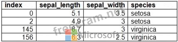
A sample of the data is shown in the following table.
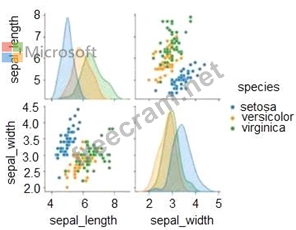
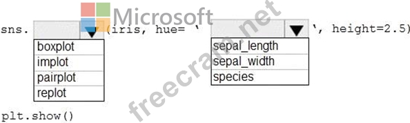
You need to create the visual shown in the exhibit. (Click the Exhibit tab.)
How should you complete the Python code? To answer, select the appropriate options in the answer area.
NOTE: Each correct selection is worth one point.
You run the following code cell to import a dataset named Iris.
A sample of the data is shown in the following table.
You need to create the visual shown in the exhibit. (Click the Exhibit tab.)
How should you complete the Python code? To answer, select the appropriate options in the answer area.
NOTE: Each correct selection is worth one point.
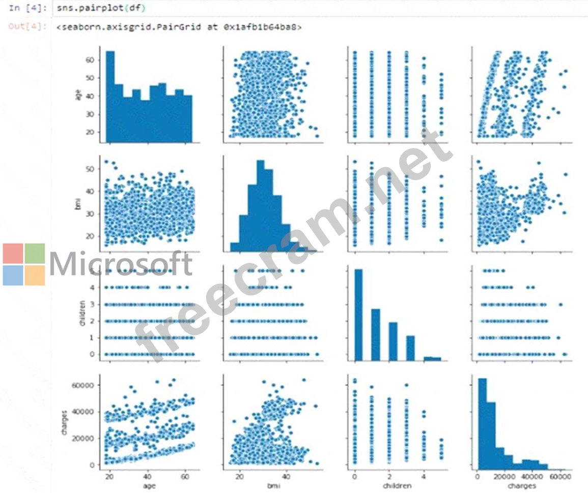
Correct Answer:
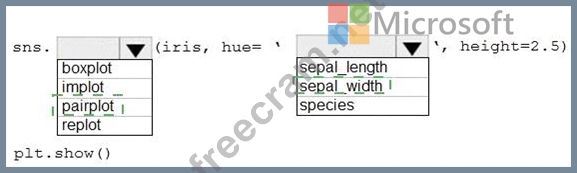
Explanation
Box 1: pairplot
A pairs plot allows us to see both distribution of single variables and relationships between two variables. Pair plots are a great method to identify trends for follow-up analysis and, fortunately, are easily implemented in Python!
Example, let's plot data using pairplot:
From the picture below, we can observe the variations in each plot. The plots are in matrix format where the row name represents x axis and column name represents the y axis. The main-diagonal subplots are the univariate histograms (distributions) for each attribute.
A picture containing diagram Description automatically generated
Box 2: sepal_width
sepal_width is displayed with a height of 2.5 (between 2.0 and 4.5).
Reference: https://medium.com/analytics-vidhya/pairplot-visualization-16325cd725e6


- Question List (70q)
- Question 1: Which two possible tools can you use to identify what causes...
- Question 2: You have a kiosk that displays a Power Bl report page. The r...
- Question 3: You open a Power Bl Desktop report that contains an imported...
- Question 4: Note: This question is part of a series of questions that pr...
- Question 5: You have a Power BI report named Report1. Repor1 is connecte...
- Question 6: You are using a Python notebook in an Apache Spark pool in A...
- Question 7: After you answer a question in this section, you will NOT be...
- Question 8: Note: This question is part of a series of questions that pr...
- Question 9: You need to recommend a security solution for the Power Bl t...
- Question 10: Note: This question is part of a series of questions that pr...
- Question 11: You are creating a Python visual in Power Bl Desktop. You ne...
- Question 12: You need to identify the root cause of the data refresh issu...
- Question 13: The group registers the Power Bl tenant as a data source1. Y...
- Question 14: You have a Power Bl tenant. You need to ensure that all repo...
- Question 15: You have a Power Bl dataset that contains two tables named T...
- Question 16: You discover a poorly performing measure in a Power Bl data ...
- Question 17: You use Azure Synapse Analytics and Apache Spark notebooks t...
- Question 18: You have a Power BI workspace named Workspace1 that contains...
- Question 19: You have a dataset that is populated from a list of business...
- Question 20: You need to integrate the external data source to support th...
- Question 21: You have a group of data scientists who must create machine ...
- Question 22: After you answer a question in this section, you will NOT be...
- Question 23: You are using GitHub as a source control solution for an Azu...
- Question 24: Note: This question is part of a series of questions that pr...
- Question 25: You have a Power Bl report that contains one visual. You nee...
- Question 26: You have a Power Bl dataset. The dataset contains data that ...
- Question 27: You have a Power Bl workspace that contains one dataset and ...
- Question 28: You have a Power Bl data model. You need to refresh the data...
- Question 29: You have a Power Bl tenant that is linked to an Azure AD ten...
- Question 30: You are using an Azure Synapse notebook to create a Python v...
- Question 31: You are creating a Power B1 single-page report. Some users w...
- Question 32: You need to populate the CustomersWithProductScore table. Ho...
- Question 33: You are configuring an aggregation table as shown in the fol...
- Question 34: You have an Azure Synapse Analytics dedicated SQL pool and a...
- Question 35: You need to create the customized Power Bl usage reporting. ...
- Question 36: You are using an Azure Synapse Analytics serverless SQL pool...
- Question 37: You have a Power Bl dataset that contains the following meas...
- Question 38: Note: This question is part of a series of questions that pr...
- Question 39: You have the following code in an Azure Synapse notebook. (E...
- Question 40: You are enhancing a Power Bl model that has DAX calculations...
- Question 41: The enterprise analytics team needs to notify the report own...
- Question 42: Your company is migrating its current, custom-built reportin...
- Question 43: You have a Power Bl tenant that is linked to an Azure AD ten...
- Question 44: You are creating a Power Bl report that will contain multipl...
- Question 45: You have an Azure Synapse workspace named Workspace1. You ne...
- Question 46: You have an Azure Synapse Analytics dedicated SQL pool that ...
- Question 47: You are planning a Power Bl solution for a customer. The cus...
- Question 48: You have a Power Bl dataset that has only the necessary fiel...
- Question 49: You have an Azure Data Lake Storage Gen 2 container that sto...
- Question 50: You develop a solution that uses a Power Bl Premium capacity...
- Question 51: You have an Azure Synapse notebook. You need to create the v...
- Question 52: Note: This question is part of a series of questions that pr...
- Question 53: You have an Azure Synapse Analytics serverless SQL pool. You...
- Question 54: You are using DAX Studio to analyze a slow-running report qu...
- Question 55: You use Vertipaq Analyzer to analyze a model. The Relationsh...
- Question 56: You have a Power Bl report that contains a bar chart. The ba...
- Question 57: You have a Power BI report and dataset in Power BI Desktop. ...
- Question 58: You are building a Power Bl dataset that will use two data s...
- Question 59: You have a deployment pipeline for a Power BI workspace. The...
- Question 60: You have five Power Bl reports that contain R script data so...
- Question 61: You have two Power BI reports named Report1 and Report2. Rep...
- Question 62: The enterprise analytics team needs to create a view for the...
- Question 63: You have a Power Bl report that contains the visual shown in...
- Question 64: You have a Power Bl dataset that uses DirectQuery against an...
- Question 65: You are using a Python notebook in an Apache Spark pool in A...
- Question 66: You have the Power BI workspaces shown in the following exhi...
- Question 67: You need to recommend a solution to ensure that sensitivity ...
- Question 68: You need to recommend a solution to add new fields to the fi...
- Question 69: You need to create Power BI reports that will display data b...
- Question 70: You have a Power Bl report that contains a card. The card di...
