- Home
- Microsoft
- Designing and Implementing a Data Science Solution on Azure
- Microsoft.DP-100.v2025-09-01.q254
- Question 2
Valid DP-100 Dumps shared by EduDump.com for Helping Passing DP-100 Exam! EduDump.com now offer the newest DP-100 exam dumps, the EduDump.com DP-100 exam questions have been updated and answers have been corrected get the newest EduDump.com DP-100 dumps with Test Engine here:
Access DP-100 Dumps Premium Version
(528 Q&As Dumps, 35%OFF Special Discount Code: freecram)
<< Prev Question Next Question >>
Question 2/254
Hotspot Question
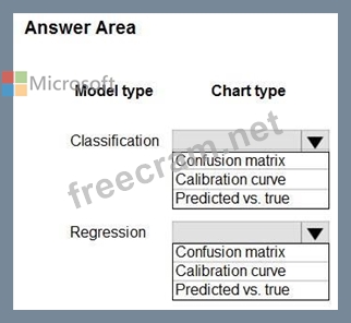
You train classification and regression models by using automated machine learning.
You must evaluate automated machine learning experiment results. The results include how a classification model is making systematic errors in its predictions and the relationship between the target feature and the regression model's predictions. You must use charts generated by automated machine learning.
You need to choose a chart type for each model type.
Which chart types should you use? To answer, select the appropriate options in the answer area.
NOTE: Each correct selection is worth one point.
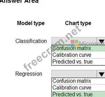
Correct Answer:
Explanation:
The calibration curve plots a model's confidence in its predictions against the proportion of positive samples at each confidence level.
https://learn.microsoft.com/en-us/azure/machine-learning/how-to-understand-automated- ml?view=azureml-api-2#calibration-curve The predicted vs. true chart plots the relationship between the target feature (true/actual values) and the model's predictions.
https://learn.microsoft.com/en-us/azure/machine-learning/how-to-understand-automated- ml?view=azureml-api-2#predicted-vs-true


- Question List (254q)
- Question 1: Hotspot Question You are using the Azure Machine Learning de...
- Question 2: Hotspot Question You train classification and regression mod...
- Question 3: You use the Azure Machine Learning designer to create and ru...
- Question 4: Hotspot Question You train a machine learning model by using...
- Question 5: Hotspot Question You create an Azure Machine Learning worksp...
- Question 6: You need to select a feature extraction method. Which method...
- Question 7: Hotspot Question You have an Azure Machine Learning workspac...
- Question 8: You manage an Azure Machine Learning workspace named Workspa...
- Question 9: You plan to create a speech recognition deep learning model....
- Question 10: You train a model and register it in your Azure Machine Lear...
- Question 11: You have an Azure Machine Learning workspace. You are connec...
- Question 12: Hotspot Question You create a list of movie descriptions in ...
- Question 13: Drag and Drop Question You have an Azure Machine Learning wo...
- Question 14: You are attaching an Azure Databricks-based compute resource...
- Question 15: Hotspot Question You are developing a machine learning, expe...
- Question 16: Drag and Drop Question An organization uses Azure Machine Le...
- Question 17: You plan to deliver a hands-on workshop to several students....
- Question 18: Hotspot Question You write code to retrieve an experiment th...
- Question 19: You are evaluating a completed binary classification machine...
- Question 20: You build a data pipeline in an Azure Machine Learning works...
- Question 21: Drag and Drop Question You are producing a multiple linear r...
- Question 22: You train a machine learning model. You must deploy the mode...
- Question 23: You use the following code to run a script as an experiment ...
- Question 24: Note: This question is part of a series of questions that pr...
- Question 25: Hotspot Question You are using C-Support Vector classificati...
- Question 26: Hotspot Question You create an Azure Machine Learning worksp...
- Question 27: You are analyzing a dataset containing historical data from ...
- Question 28: Note: This question is part of a series of questions that pr...
- Question 29: Note: This question is part of a series of questions that pr...
- Question 30: You manage an Azure Machine Learning workspace. You build a ...
- Question 31: You manage an Azure Machine Learning workspace. The workspac...
- Question 32: You are training machine learning models in Azure Machine Le...
- Question 33: Note: This question is part of a series of questions that pr...
- Question 34: You use the Azure Machine Learning SDK v2 for Python and not...
- Question 35: You register a model that you plan to use in a batch inferen...
- Question 36: Hotspot Question You have an Azure Machine learning workspac...
- Question 37: Hotspot Question You are using the Hyperdrive feature in Azu...
- Question 38: Drag and Drop Question You previously deployed a model that ...
- Question 39: Hotspot Question You have a dataset that contains 2,000 rows...
- Question 40: Hotspot Question You create an Azure Data Lake Storage Gen2 ...
- Question 41: You train and register a model in your Azure Machine Learnin...
- Question 42: Hotspot Question Complete the sentence by selecting the corr...
- Question 43: Hotspot Question You need to configure the Feature Based Fea...
- Question 44: Note: This question is part of a series of questions that pr...
- Question 45: Hotspot Question You have an Azure Machine Learning workspac...
- Question 46: Hotspot Question You have a multi-class image classification...
- Question 47: Note: This question is part of a series of questions that pr...
- Question 48: You use Azure Machine Learning to train a model. You must us...
- Question 49: Note: This question is part of a series of questions that pr...
- Question 50: Hotspot Question You are developing code to analyze a datase...
- Question 51: You use differential privacy to ensure your reports are priv...
- Question 52: You use Azure Machine Learning Studio to build a machine lea...
- Question 53: Hotspot Question You use an Azure Machine Learning workspace...
- Question 54: Drag and Drop Question You configure a Deep Learning Virtual...
- Question 55: You create a multi-class image classification deep learning ...
- Question 56: Hotspot Question You create an Azure Machine learning worksp...
- Question 57: You manage an Azure Machine Learning workspace. You must set...
- Question 58: You are determining if two sets of data are significantly di...
- Question 59: You have an Azure Machine Learning workspace named WS1. You ...
- Question 60: You create an Azure Machine Learning workspace named workspa...
- Question 61: Note: This question is part of a series of questions that pr...
- Question 62: Hotspot Question You plan to use Hyperdrive to optimize the ...
- Question 63: Hotspot Question You are hired as a data scientist at a wine...
- Question 64: You create an MLflow model. You must deploy the model to Azu...
- Question 65: You create a batch inference pipeline by using the Azure ML ...
- Question 66: Hotspot Question You are retrieving data from a large datast...
- Question 67: You are developing deep learning models to analyze semi-stru...
- Question 68: You are building a regression model for estimating the numbe...
- Question 69: Hotspot Question You create an Azure Machine Learning model ...
- Question 70: Drag and Drop Question You train and register a model by usi...
- Question 71: Hotspot Question You have an Azure blob container that conta...
- Question 72: You are a data scientist working for a hotel booking website...
- Question 73: Note: This question is part of a series of questions that pr...
- Question 74: Note: This question is part of a series of questions that pr...
- Question 75: Note: This question is part of a series of questions that pr...
- Question 76: Note: This question is part of a series of questions that pr...
- Question 77: Note: This question is part of a series of questions that pr...
- Question 78: Note: This question is part of a series of questions that pr...
- Question 79: Hotspot Question You need to set up the Permutation Feature ...
- Question 80: Hotspot Question You create an Azure Machine Learning worksp...
- Question 81: Drag and Drop Question You manage an Azure Machine Learning ...
- Question 82: You are creating a binary classification by using a two-clas...
- Question 83: Drag and Drop Question You need to produce a visualization f...
- Question 84: Hotspot Question You need to identify the methods for dividi...
- Question 85: Note: This question is part of a series of questions that pr...
- Question 86: Note: This question is part of a series of questions that pr...
- Question 87: Hotspot Question A coworker registers a datastore in a Machi...
- Question 88: You are implementing a machine learning model to predict sto...
- Question 89: You create a binary classification model. You need to evalua...
- Question 90: Hotspot Question You need to replace the missing data in the...
- Question 91: Note: This question is part of a series of questions that pr...
- Question 92: You are analyzing a dataset by using Azure Machine Learning ...
- Question 93: You are planning to register a trained model in an Azure Mac...
- Question 94: Hotspot Question You use Azure Machine Learning to implement...
- Question 95: Note: This question is part of a series of questions that pr...
- Question 96: Hotspot Question You manage an Azure Machine Learning worksp...
- Question 97: You create an Azure Machine Learning workspace. The workspac...
- Question 98: You manage an Azure Machine Learning workspace. You plan to ...
- Question 99: Note: This question is part of a series of questions that pr...
- Question 100: Drag and Drop Question You are designing an Azure Machine Le...
- Question 101: Hotspot Question You manage an Azure Machine Learning worksp...
- Question 102: Hotspot Question You train a model by using Azure Machine Le...
- Question 103: You are solving a classification task. The dataset is imbala...
- Question 104: Drag and Drop Question You are building an intelligent solut...
- Question 105: Note: This question is part of a series of questions that pr...
- Question 106: You are a lead data scientist for a project that tracks the ...
- Question 107: You need to implement a new cost factor scenario for the ad ...
- Question 108: Hotspot Question You create a script for training a machine ...
- Question 109: You write a Python script that processes data in a comma-sep...
- Question 110: You train and publish a machine learning model. You need to ...
- Question 111: You are with a time series dataset in Azure Machine Learning...
- Question 112: Hotspot Question You download a .csv file from a notebook in...
- Question 113: Note: This question is part of a series of questions that pr...
- Question 114: Hotspot Question You create an Azure Machine Learning worksp...
- Question 115: Hotspot Question You are the owner of an Azure Machine Learn...
- Question 116: You create an Azure Machine Learning workspace named ML-work...
- Question 117: Note: This question is part of a series of questions that pr...
- Question 118: You need to implement a model development strategy to determ...
- Question 119: Note: This question is part of a series of questions that pr...
- Question 120: You have an Azure Machine Learning workspace. You plan to tu...
- Question 121: Drag and Drop Question You have an Azure Machine Learning wo...
- Question 122: Hotspot Question You are creating a machine learning model i...
- Question 123: Drag and Drop Question You manage an Azure Machine Learning ...
- Question 124: You create a training pipeline by using the Azure Machine Le...
- Question 125: Note: This question is part of a series of questions that pr...
- Question 126: Note: This question is part of a series of questions that pr...
- Question 127: You plan to create a compute instance as part of an Azure Ma...
- Question 128: You run a script as an experiment in Azure Machine Learning....
- Question 129: Drag and Drop Question You configure a Deep Learning Virtual...
- Question 130: You have a dataset that is stored in an Azure Machine Learni...
- Question 131: You use the Azure Machine Learning service to create a tabul...
- Question 132: A company is designing a solution that uses Azure Databricks...
- Question 133: Drag and Drop Question You create an Azure Machine Learning ...
- Question 134: You use the Azure Machine Learning SDK for Python to create ...
- Question 135: Drag and Drop Question You need to implement an early stoppi...
- Question 136: You manage an Azure Machine Learning workspace named workspa...
- Question 137: Drag and Drop Question You are producing a multiple linear r...
- Question 138: Hotspot Question You are preparing to build a deep learning ...
- Question 139: You manage an Azure Machine Learning workspace. You must cre...
- Question 140: Note: This question is part of a series of questions that pr...
- Question 141: You run an automated machine learning experiment in an Azure...
- Question 142: Hotspot Question You have a feature set containing the follo...
- Question 143: Hotspot Question You create a new Azure Databricks workspace...
- Question 144: You manage an Azure Machine Learning Workspace named Workspa...
- Question 145: Drag and Drop Question You need to modify the inputs for the...
- Question 146: You are using a ScriptRunConfig object to configure an exper...
- Question 147: Hotspot Question You load data from a notebook in an Azure M...
- Question 148: You manage an Azure Machine Learning workspace. You choose t...
- Question 149: Hotspot Question You have a binary classifier that predicts ...
- Question 150: Hotspot Question You are using hyperparameter tuning in Azur...
- Question 151: You create a workspace by using Azure Machine Learning Studi...
- Question 152: You are using Azure Machine Learning to monitor a trained an...
- Question 153: Note: This question is part of a series of questions that pr...
- Question 154: You have an Azure Machine Learning workspace. You plan to us...
- Question 155: You manage an Azure Machine Learning workspace by using the ...
- Question 156: You must store data in Azure Blob Storage to support Azure M...
- Question 157: Note: This question is part of a series of questions that pr...
- Question 158: You plan to use the Hyperdrive feature of Azure Machine Lear...
- Question 159: You are developing a machine learning model. You must infere...
- Question 160: You are a data scientist building a deep convolutional neura...
- Question 161: You manage an Azure Machine Learning workspace. You experime...
- Question 162: Hotspot Question You manage an Azure Machine Learning worksp...
- Question 163: Hotspot Question You are running a training experiment on re...
- Question 164: Hotspot Question You have machine learning models that produ...
- Question 165: Hotspot Question You arc I mating a deep learning model to i...
- Question 166: Hotspot Question You manage an Azure Machine Learning worksp...
- Question 167: You create an Azure Machine Learning workspace. You train an...
- Question 168: You run Azure Machine Learning training experiments. The tra...
- Question 169: Hotspot Question You publish a batch inferencing pipeline th...
- Question 170: You manage an Azure Machine Learning workspace. You must pro...
- Question 171: You are implementing hyperparameter tuning for a model train...
- Question 172: You train and register a machine learning model. You create ...
- Question 173: Hotspot Question You are tuning a hyperparameter for an algo...
- Question 174: You are analyzing a dataset containing historical data from ...
- Question 175: Drag and Drop Question You create an Azure Machine Learning ...
- Question 176: Note: This question is part of a series of questions that pr...
- Question 177: Drag and Drop Question You have an Azure Machine Learning wo...
- Question 178: You are creating a classification model for a banking compan...
- Question 179: You have a Jupyter Notebook that contains Python code that i...
- Question 180: Hotspot Question You use an Azure Machine Learning workspace...
- Question 181: Hotspot Question You are creating data wrangling and model t...
- Question 182: You create an Azure Machine Learning managed compute resourc...
- Question 183: You create an Azure Machine Learning workspace. You must con...
- Question 184: You need to select an environment that will meet the busines...
- Question 185: You are creating a new Azure Machine Learning pipeline using...
- Question 186: Note: This question is part of a series of questions that pr...
- Question 187: Hotspot Question You manage an Azure Machine Learning worksp...
- Question 188: Hotspot Question You build a data pipeline in an Azure Machi...
- Question 189: Drag and Drop Question You create an Azure Machine Learning ...
- Question 190: Note: This question is part of a series of questions that pr...
- Question 191: Note: This question is part of a series of questions that pr...
- Question 192: Hotspot Question You manage an Azure Machine Learning worksp...
- Question 193: You create an Azure Machine Learning workspace. You use Azur...
- Question 194: Drag and Drop Question You need to define a modeling strateg...
- Question 195: You need to evaluate the potential risk of exposing personal...
- Question 196: You need to select a pre built development environment for a...
- Question 197: Hotspot Question You use an Azure Machine Learning workspace...
- Question 198: Note: This question is part of a series of questions that pr...
- Question 199: Note: This question is part of a series of questions that pr...
- Question 200: Hotspot Question You manage an Azure Machine Learning worksp...
- Question 201: You plan to use automated machine learning by using Azure Ma...
- Question 202: Note: This question is part of a series of questions that pr...
- Question 203: You have a dataset that contains records of patients tested ...
- Question 204: You manage an Azure Machine Learning workspace. You plan to ...
- Question 205: Drag and Drop Question YOU have a data-set that contains ove...
- Question 206: You create an Azure Machine Learning workspace. You train an...
- Question 207: You have an Azure Machine Learning workspace and a serverles...
- Question 208: Drag and Drop Question You create a training pipeline using ...
- Question 209: You create a datastore named training_data that references a...
- Question 210: You use the following code to define the steps for a pipelin...
- Question 211: Note: This question is part of a series of questions that pr...
- Question 212: Hotspot Question You manage an Azure Machine Learning worksp...
- Question 213: Hotspot Question Complete the sentence by selecting the corr...
- Question 214: Note: This question is part of a series of questions that pr...
- Question 215: You use the Azure Machine Learning SDK in a notebook to run ...
- Question 216: Hotspot Question You have an Azure Machine Learning workspac...
- Question 217: Drag and Drop Question You have several machine learning mod...
- Question 218: Drag and Drop Question You create an Azure Machine Learning ...
- Question 219: Note: This question is part of a series of questions that pr...
- Question 220: Note: This question is part of a series of questions that pr...
- Question 221: You create an Azure Machine Learning workspace. You are prep...
- Question 222: Note: This question is part of a series of questions that pr...
- Question 223: You manage an Azure Machine Learning workspace. You use Azur...
- Question 224: Drag and Drop Question You use a training pipeline in the Az...
- Question 225: Hotspot Question You plan to preprocess text from CSV files....
- Question 226: Note: This question is part of a series of questions that pr...
- Question 227: Note: This question is part of a series of questions that pr...
- Question 228: Hotspot Question You are using Azure Machine Learning to tra...
- Question 229: You create a binary classification model. The model is regis...
- Question 230: Drag and Drop Question You use Azure Machine Learning to dep...
- Question 231: Hotspot Question You collect data from a nearby weather stat...
- Question 232: Hotspot Question You have an Azure Machine Learning workspac...
- Question 233: You are developing a machine learning model by using Azure M...
- Question 234: Hotspot Question You create an Azure Databricks workspace an...
- Question 235: You deploy a model as an Azure Machine Learning real-time we...
- Question 236: Hotspot Question You are analyzing the asymmetry in a statis...
- Question 237: A company manufactures automobile parts. The company install...
- Question 238: Drag and Drop Question You have an Azure Machine Learning wo...
- Question 239: Note: This question is part of a series of questions that pr...
- Question 240: Hotspot Question You create an Azure Machine Learning datase...
- Question 241: Drag and Drop Question You are developing a machine learning...
- Question 242: Hotspot Question You have an Azure subscription that contain...
- Question 243: Hotspot Question You create an Azure Machine Learning worksp...
- Question 244: Hotspot Question You create an Azure Machine Learning worksp...
- Question 245: Hotspot Question You are developing a deep learning model by...
- Question 246: You are implementing hyperparameter tuning by using Bayesian...
- Question 247: You are performing clustering by using the K-means algorithm...
- Question 248: You create a binary classification model. You use the Fairle...
- Question 249: You have a comma-separated values (CSV) file containing data...
- Question 250: Note: This question is part of a series of questions that pr...
- Question 251: Drag and Drop Question You manage an Azure Machine Learning ...
- Question 252: You manage an Azure Machine Learning workspace that includes...
- Question 253: Hotspot Question You create a Python script named train.py a...
- Question 254: Note: This question is part of a series of questions that pr...
