- Home
- Microsoft
- Developing ASP.NET MVC 4 Web Applications
- Microsoft.70-486.v2019-06-05.q127
- Question 8
Valid 70-486 Dumps shared by ExamDiscuss.com for Helping Passing 70-486 Exam! ExamDiscuss.com now offer the newest 70-486 exam dumps, the ExamDiscuss.com 70-486 exam questions have been updated and answers have been corrected get the newest ExamDiscuss.com 70-486 dumps with Test Engine here:
Access 70-486 Dumps Premium Version
(230 Q&As Dumps, 35%OFF Special Discount Code: freecram)
<< Prev Question Next Question >>
Question 8/127
You are developing an ASP.NET MVC web application for viewing a photo album. The application is
designed for devices that support changes in orientation, such as tablets and smartphones. The
application displays a grid of photos in portrait mode.
When the orientation changes to landscape, each tile in the grid expands to include a description. The
HTML that creates the gallery interface resembles the following markup.
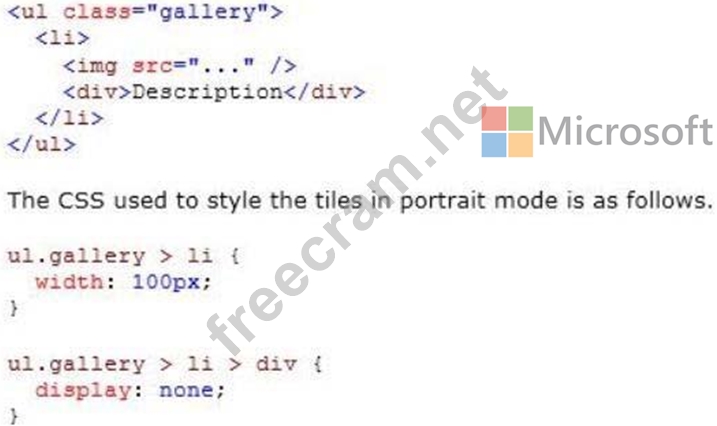
If this CSS is omitted, the existing CSS displays the tiles in landscape mode.
You need to update the portrait mode CSS to apply only to screens with a width less than 500 pixels.
Which code segment should you use?
designed for devices that support changes in orientation, such as tablets and smartphones. The
application displays a grid of photos in portrait mode.
When the orientation changes to landscape, each tile in the grid expands to include a description. The
HTML that creates the gallery interface resembles the following markup.
If this CSS is omitted, the existing CSS displays the tiles in landscape mode.
You need to update the portrait mode CSS to apply only to screens with a width less than 500 pixels.
Which code segment should you use?
Correct Answer: D
Explanation/Reference:
Explanation:
Screen is used for computer screens, tablets, smart-phones etc.
max-width is the maximum width of the display area, suchas a browser window.
References: http://www.w3schools.com/cssref/css3_pr_mediaquery.asp
Explanation:
Screen is used for computer screens, tablets, smart-phones etc.
max-width is the maximum width of the display area, suchas a browser window.
References: http://www.w3schools.com/cssref/css3_pr_mediaquery.asp


- Question List (127q)
- 1 commentQuestion 1: You are developing an ASP.NET MVC application to be used on ...
- Question 2: You develop an ASP.NET MVC application. The application incl...
- Question 3: You are developing an ASP.NET MVC application. The applicati...
- Question 4: You are developing an ASP.NET MVC application that uses form...
- Question 5: You need to ensure that developers can connect to a Windows ...
- Question 6: You need to add an action to RunLogController to validate th...
- Question 7: You are designing a localized ASP.NET application to support...
- Question 8: You are developing an ASP.NET MVC web application for viewin...
- Question 9: You are developing an ASP.NET Core web application. The web ...
- Question 10: You are designing an HTML5 website. You need to design the i...
- Question 11: Note: This question is part of a series of questions that pr...
- Question 12: You are designing a data-oriented application that features ...
- Question 13: You are developing an ASP.NET MVC application that uses form...
- Question 14: You are developing an ASP.NET MVC application by using Visua...
- Question 15: You are developing an ASP.NET MVC application. Devices that ...
- Question 16: You need to ensure that all the MVC controllers are secure. ...
- Question 17: You are developing an ASP.NET Core MVC web application that ...
- Question 18: You are designing a distributed application. The application...
- Question 19: You are developing an ASP.NET MVC application that uses form...
- Question 20: You develop an ASP.NET MVC application. The application has ...
- Question 21: You are creating a new authentication system that uses an HT...
- Question 22: You are designing a Windows Communication Foundation (WCF) s...
- Question 23: You need to ensure that new customers enter a valid email ad...
- Question 24: You are developing an ASP.NET MVC application. The applicati...
- Question 25: You are designing a distributed banking application that han...
- Question 26: You are maintaining an ASP.NET MVC application that runs on ...
- Question 27: You need to make all of the rows in the table bold in the Vi...
- Question 28: You are testing an ASP.NET application. The test plan requir...
- Question 29: You are developing an ASP.NET MVC application that will be d...
- Question 30: You are developing an ASP.NET MVC web application for viewin...
- Question 31: You are developing an ASP.NET MVC application that will be d...
- Question 32: You are developing an ASP.NET MVC web application in Visual ...
- Question 33: You are designing an enterprise-level Windows Communication ...
- Question 34: You are designing a distributed application that runs on the...
- Question 35: The date of the run must be displayed in Views\Runlog\GetLog...
- Question 36: The RunLog/Views/InsertLog.cshtml view must display the /Ima...
- Question 37: You are designing a ASP.NET Core MVC application that runs o...
- Question 38: You are preparing for the deployment of an ASP.NET MVC appli...
- Question 39: An advertising campaign was recently launched. Some of the a...
- Question 40: You are developing an ASP.NET MVC application. The applicati...
- Question 41: You are designing a distributed application. The application...
- Question 42: Note: This question is part of a series of questions that pr...
- Question 43: The transcode.exe utility activates its license online when ...
- Question 44: You have a class that includes the following code. (Line num...
- Question 45: You are developing a NuGet package that will be used by appl...
- Question 46: You need to add a method to the ProductController class to m...
- Question 47: Note: This question is part of a series of questions that pr...
- Question 48: You are developing an ASP.NET Core MVC web application that ...
- Question 49: You are developing a controller for an ASP.NET MVC applicati...
- Question 50: Note: This question is part of a series of questions that pr...
- Question 51: You are developing an application that supports multiple cul...
- Question 52: Note: This question is part of a series of questions that pr...
- Question 53: You develop an ASP.NET MVC application. The application is c...
- Question 54: You plan to deploy an ASP.NET Core MVC web application to an...
- Question 55: You need to ensure that all customers can delete videos rega...
- Question 56: You are developing an application that uses many small image...
- Question 57: You are developing an ASP.NET MVC application that will be d...
- Question 58: You are developing an ASP.NET MVC application. You need to a...
- Question 59: You are developing an ASP.NET MVC application that will be d...
- Question 60: You are developing an ASP.NET MVC application. The applicati...
- Question 61: Note: This question is part of a series of questions that pr...
- Question 62: You define a startup task in the ServiceDefinition.csdef fil...
- Question 63: You are developing an ASP.NET MVC application that enables y...
- Question 64: You are developing an ASP.NET MVC application. The applicati...
- Question 65: You are developing an ASP.NET MVC news aggregation applicati...
- Question 66: You are building an ASP.NET web application. You must test t...
- Question 67: You develop a web application locally in Microsoft Visual St...
- Question 68: You are developing an ASP.NET MVC application by using Visua...
- Question 69: Note: This question is part of a series of questions that pr...
- Question 70: You updated the web.config file with the HTTP run-time value...
- Question 71: You need to update the routes to ensure that a product is al...
- Question 72: You are developing an ASP.NET MVC application by using Micro...
- Question 73: You are developing an ASP.NET MVC web application that inclu...
- Question 74: You are designing an ASP.NET Core MVC application. You need ...
- Question 75: You need to ensure that all the MVC controllers are secure. ...
- Question 76: You develop a new ASP.NET MVC application. You use local sto...
- Question 77: You need to implement the requirements for handling IIS erro...
- Question 78: Customers download videos by using HTTP clients that support...
- Question 79: You are developing an ASP.NET MVC application. The applicati...
- Question 80: You deploy an ASP.NET MVC Web application to Internet Inform...
- Question 81: You need to extend the edit functionality of RunLogControlle...
- Question 82: You are developing an ASP.NET MVC application. The applicati...
- Question 83: You need to implement client-side animations according to th...
- Question 84: When users attempt to retrieve a product from the product pa...
- Question 85: You are developing an ASP.NET MVC application that will run ...
- Question 86: Your company uses Microsoft Azure DevTest Labs for testing a...
- Question 87: You need to configure session storage in the web.config file...
- Question 88: You are developing an ASP.NET Core MVC web application. You ...
- Question 89: You are designing an MVC web application. The view must be a...
- Question 90: You need to implement client-side animations according to th...
- Question 91: You are authoring unit tests. The unit tests must test code ...
- Question 92: The application includes the following method. (Line numbers...
- Question 93: Note: This question is part of a series of questions that pr...
- Question 94: You are designing a localized ASP.NET MVC online shopping ap...
- Question 95: You are developing a new ASP.NET MVC application that will b...
- Question 96: Note: This question is part of a series of questions that pr...
- Question 97: You are developing an ASP.NET MVC application that delivers ...
- Question 98: You are developing an ASP.NET MVC application. The applicati...
- Question 99: You develop an ASP.NET MVC application. The application has ...
- Question 100: You are designing am ASP.NET Core MVC application. The appli...
- Question 101: Customers download videos by using HTTP clients that support...
- Question 102: You need to enable client-side validation for an ASP.NET MVC...
- Question 103: You are developing an ASP.NET application that allows users ...
- Question 104: You are implementing a website redesign of an existing websi...
- Question 105: You are developing an ASP.NET application. You need to minim...
- Question 106: You are implementing a website redesign of an existing websi...
- Question 107: You are designing an HTML5 website. You need to design the i...
- Question 108: Note: This question is part of a series of questions that pr...
- Question 109: If the canvas element is supported by the client browser, th...
- Question 110: You are developing an ASP.NET MVC application that displays ...
- Question 111: You need to modify the application to meet the product Id re...
- Question 112: You are developing an ASP.NET MVC application in Visual Stud...
- Question 113: You are designing an ASP.NET Core MVC application that handl...
- Question 114: You need to implement the business requirements for managing...
- Question 115: Note: This question is part of a series of questions that pr...
- Question 116: You create an ASP.NET MVC application. You host the applicat...
- Question 117: You need to make the "Distance" header of the table bold in ...
- Question 118: You need to implement client-side animations according to th...
- Question 119: You are developing an ASP.NET MVC application. The applicati...
- Question 120: You are developing an ASP.NET MVC application that uses form...
- Question 121: You need to display the "miles" unit description after the d...
- Question 122: You need to maximize performance of video delivery. Which co...
- Question 123: You are developing an ASP.NET MVC application that uses form...
- Question 124: The GetDealPrice method must be called by using Ajax. You ne...
- Question 125: Note: This question is part of a series of questions that pr...
- Question 126: You are developing an ASP.NET MVC application that will run ...
- Question 127: You are developing an ASP.NET Core web application. The appl...
