Valid 70-357 Dumps shared by ExamDiscuss.com for Helping Passing 70-357 Exam! ExamDiscuss.com now offer the newest 70-357 exam dumps, the ExamDiscuss.com 70-357 exam questions have been updated and answers have been corrected get the newest ExamDiscuss.com 70-357 dumps with Test Engine here:
Access 70-357 Dumps Premium Version
(55 Q&As Dumps, 35%OFF Special Discount Code: freecram)
<< Prev Question Next Question >>
Question 20/51
HOTSPOT
You are developing a Universal Windows Platform (UWP) app.
You need to implement responsive user design patterns.
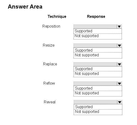
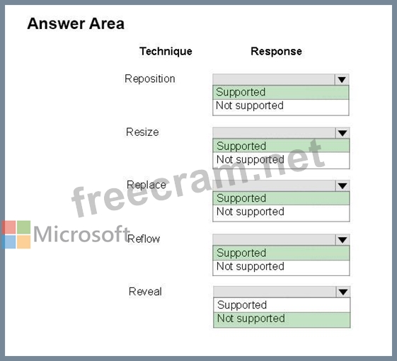
Which of the following techniques are supported? To answer, select the appropriate option from each list in the answer area.
Hot Area:
You are developing a Universal Windows Platform (UWP) app.
You need to implement responsive user design patterns.
Which of the following techniques are supported? To answer, select the appropriate option from each list in the answer area.
Hot Area:
Correct Answer:
Explanation/Reference:
Explanation:
Responsive design techniques
When you optimize your app's UI for specific screen widths, we say that you're creating a responsive design. Here are six responsive design techniques you can use to customize your app's UI.
* Reposition
You can alter the location and position of app UI elements to get the most out of each device
* Resize
You can optimize the frame size by adjusting the margins and size of UI elements.
* Reflow
By changing the flow of UI elements based on device and orientation, your app can offer an optimal display of content-
* Show/hide
You can show or hide UI elements based on screen real estate, or when the device supports additional functionality, specific situations, or preferred screen orientations.
* Replace
This technique lets you switch the user interface for a specific device size-class or orientation. In this example, the nav pane and its compact, transient UI works well for a smaller device, but on a larger device tabs might be a better choice.
* Re-architect
You can collapse or fork the architecture of your app to better target specific devices.
Reference: https://docs.microsoft.com/en-us/windows/uwp/layout/design-and-ui-intro


- Question List (51q)
- Question 1: DRAG DROP Case Study This is a case study. Case studies are ...
- Question 2: You are developing a Universal Windows Platform (UWP) app. T...
- Question 3: You have a Universal Windows Platform (UWP) app. The app has...
- Question 4: You have two Universal Windows Platform (UWP) apps named Cat...
- Question 5: HOTSPOT You are developing a Universal Windows Platform (UWP...
- Question 6: You are developing a Universal Windows Platform (UWP) app th...
- Question 7: Case Study This is a case study. Case studies are not limite...
- Question 8: HOTSPOT You are developing a Universal Windows Platform (UWP...
- Question 9: You are developing a Universal Windows Platform (UWP) app. T...
- Question 10: Case Study This is a case study. Case studies are not limite...
- Question 11: DRAG DROP You are developing a Universal Windows Platform (U...
- Question 12: DRAG DROP You are developing a Universal Windows Platform (U...
- Question 13: DRAG DROP Case Study This is a case study. Case studies are ...
- Question 14: You are designing a roadside assistance mobile app. The app ...
- Question 15: DRAG DROP Case Study This is a case study. Case studies are ...
- Question 16: Case Study This is a case study. Case studies are not limite...
- Question 17: DRAG DROP Case Study This is a case study. Case studies are ...
- Question 18: Case Study This is a case study. Case studies are not limite...
- Question 19: DRAG DROP You are developing a Universal Windows Platform (U...
- Question 20: HOTSPOT You are developing a Universal Windows Platform (UWP...
- Question 21: You must create a control that meets the following requireme...
- Question 22: Note: This question is part of a series of questions that pr...
- Question 23: HOTSPOT You are developing an app that displays photos. You ...
- Question 24: HOTSPOT Case Study This is a case study. Case studies are no...
- Question 25: You are developing a Universal Windows Platform (UWP) app th...
- Question 26: DRAG DROP Case Study This is a case study. Case studies are ...
- Question 27: Case Study This is a case study. Case studies are not limite...
- Question 28: HOTSPOT You are developing a Universal Windows Platform (UWP...
- Question 29: HOTSPOT You are developing a Universal Windows Platform (UWP...
- Question 30: HOTSPOT You have an app that includes the following method: ...
- Question 31: HOTSPOT Case Study This is a case study. Case studies are no...
- Question 32: You are developing a Universal Windows Platform (UWP) app. Y...
- Question 33: DRAG DROP You are building a Universal Windows Platform (UWP...
- Question 34: DRAG DROP Case Study This is a case study. Case studies are ...
- Question 35: DRAG DROP You are developing a Universal Windows Platform (U...
- Question 36: Case Study This is a case study. Case studies are not limite...
- Question 37: HOTSPOT You are developing a Universal Windows Platform (UWP...
- Question 38: You have to connect your app to an online identity provider ...
- Question 39: Case Study This is a case study. Case studies are not limite...
- Question 40: Case Study This is a case study. Case studies are not limite...
- Question 41: Case Study This is a case study. Case studies are not limite...
- Question 42: HOTSPOT Case Study This is a case study. Case studies are no...
- Question 43: Case Study This is a case study. Case studies are not limite...
- Question 44: HOTSPOT Case Study This is a case study. Case studies are no...
- Question 45: Case Study This is a case study. Case studies are not limite...
- Question 46: DRAG DROP Case Study This is a case study. Case studies are ...
- Question 47: DRAG DROP You are creating a Universal Windows Platform (UWP...
- Question 48: Case Study This is a case study. Case studies are not limite...
- Question 49: DRAG DROP You are developing a Universal Windows Platform (U...
- Question 50: Note: This question is part of a series of questions that pr...
- Question 51: HOTSPOT Case Study This is a case study. Case studies are no...
